


3
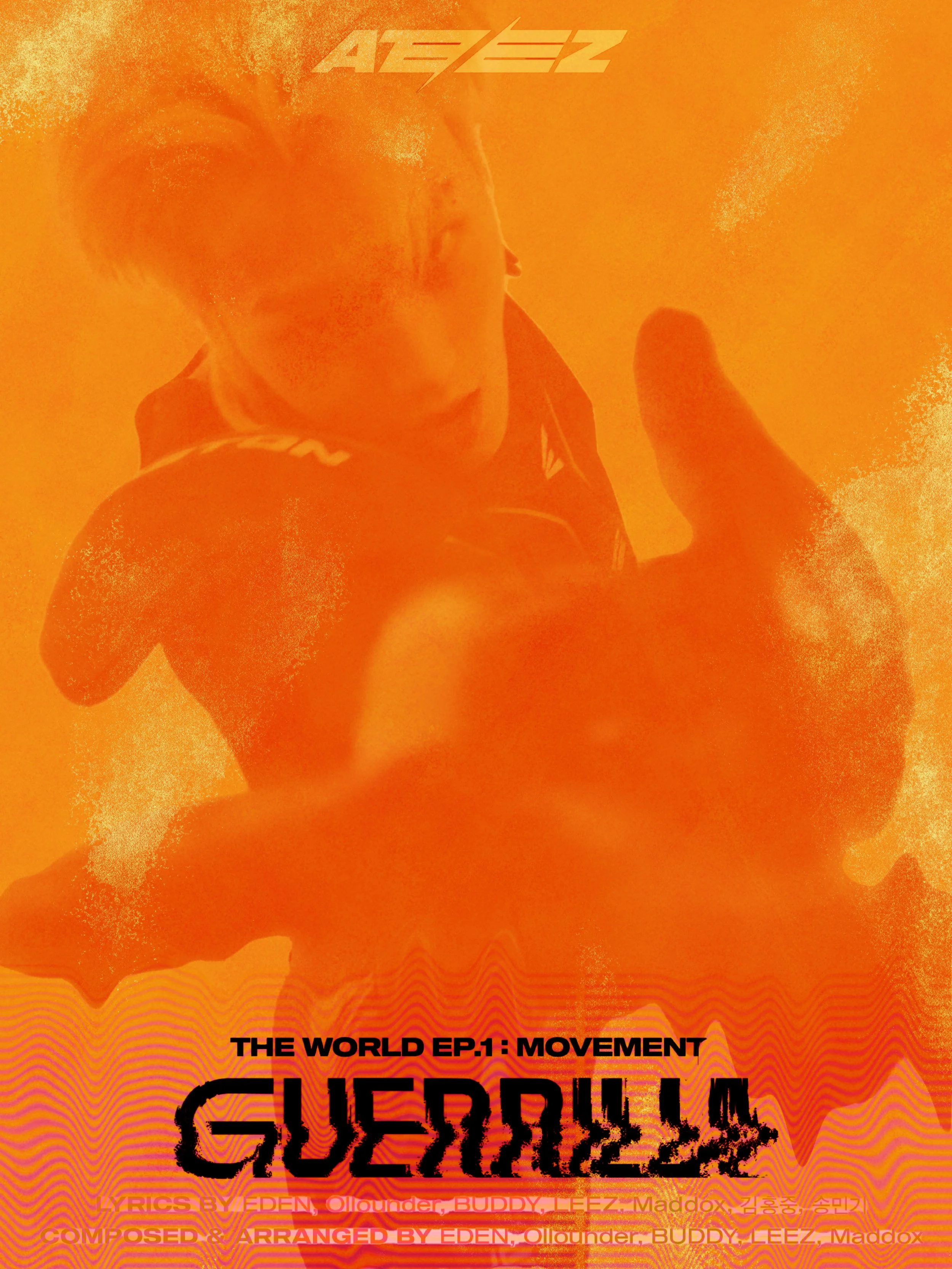
The World

3
PMN

2
143

2
Monroe
1
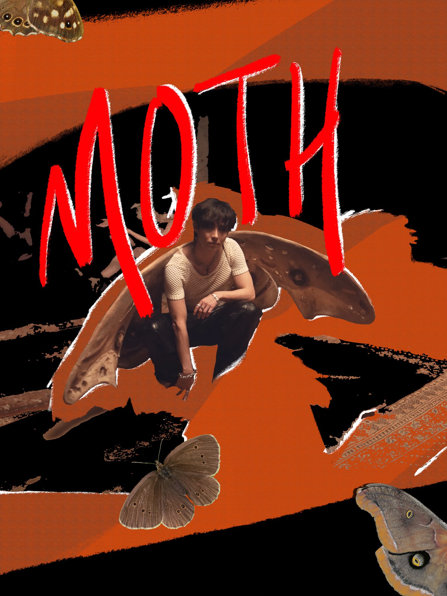
MOTH

3
Don't Call Me

2
Maverick

2
Advice

2
Cheese

4
Domino

5
Sticker

2
Lemonade

1
M.

1
Friends Forever

10
Vision
2
Drills

7
Fallin'

5
Superbloom

2
Bright Lights, Red Eyes

1
Phases

4
CALM

6
Infinitely Ordinary

0
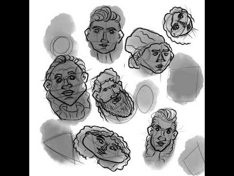
Character Portraits

8
Poetry Illustrations

3
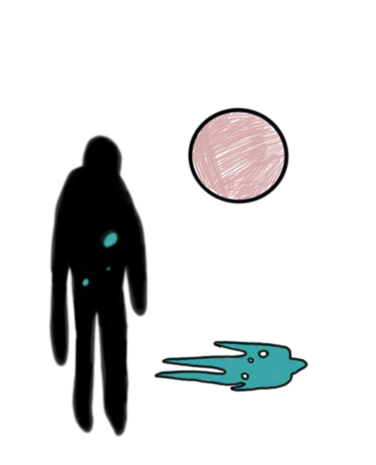
Dreams

3
Image

0
Post-it